

Software Engineering Club
Student Club
Website
Team Project
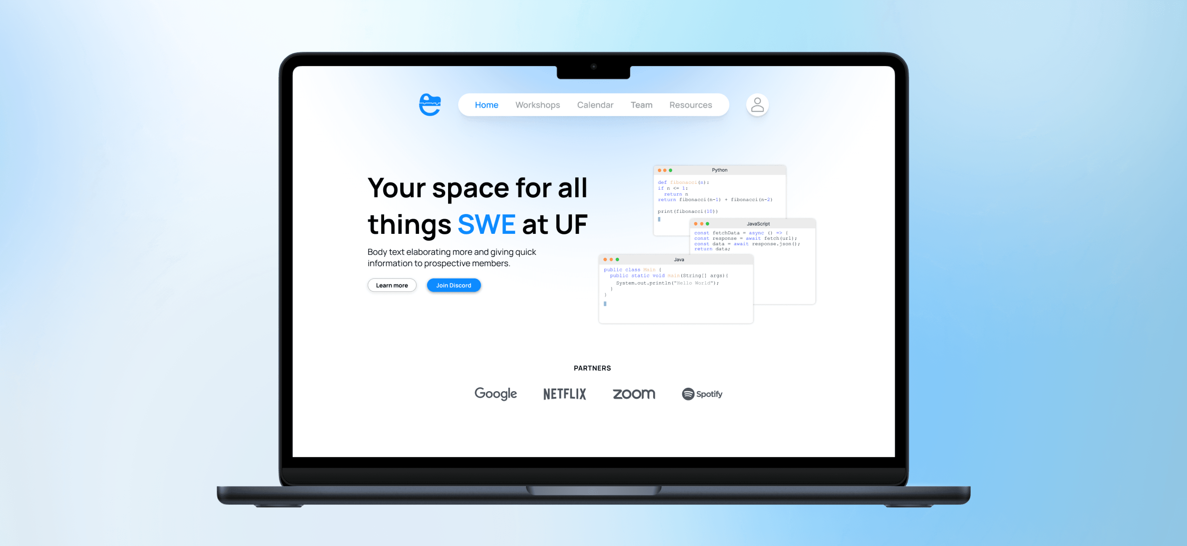
A website that brings the Software Engineering Club's scattered tools into one place. On a campus full of tech clubs, a club's site is its pitch, so we built one that gives SEC a clear identity and stays easy to keep current.
00
Introduction
Problem
One club spread across three platforms
SEC is the Software Engineering Club at UF, a student club where members build projects, run workshops, and pick up practical software skills together. Its information was spread across Discord, Notion, and Instagram, with no single place for a new member to start or a current member to check what was happening.
On a campus with dozens of tech clubs, students decide in seconds whether one is worth their time, and the website is usually the first thing they see. If the club is hard to reach online, it loses members before they ever show up.

The Goal
Build one site that gives SEC a clear identity, pitches its value to prospective members, and stays current enough to look as active as the club actually is.
01
Process
Competitive analysis
Studying how other clubs show up online
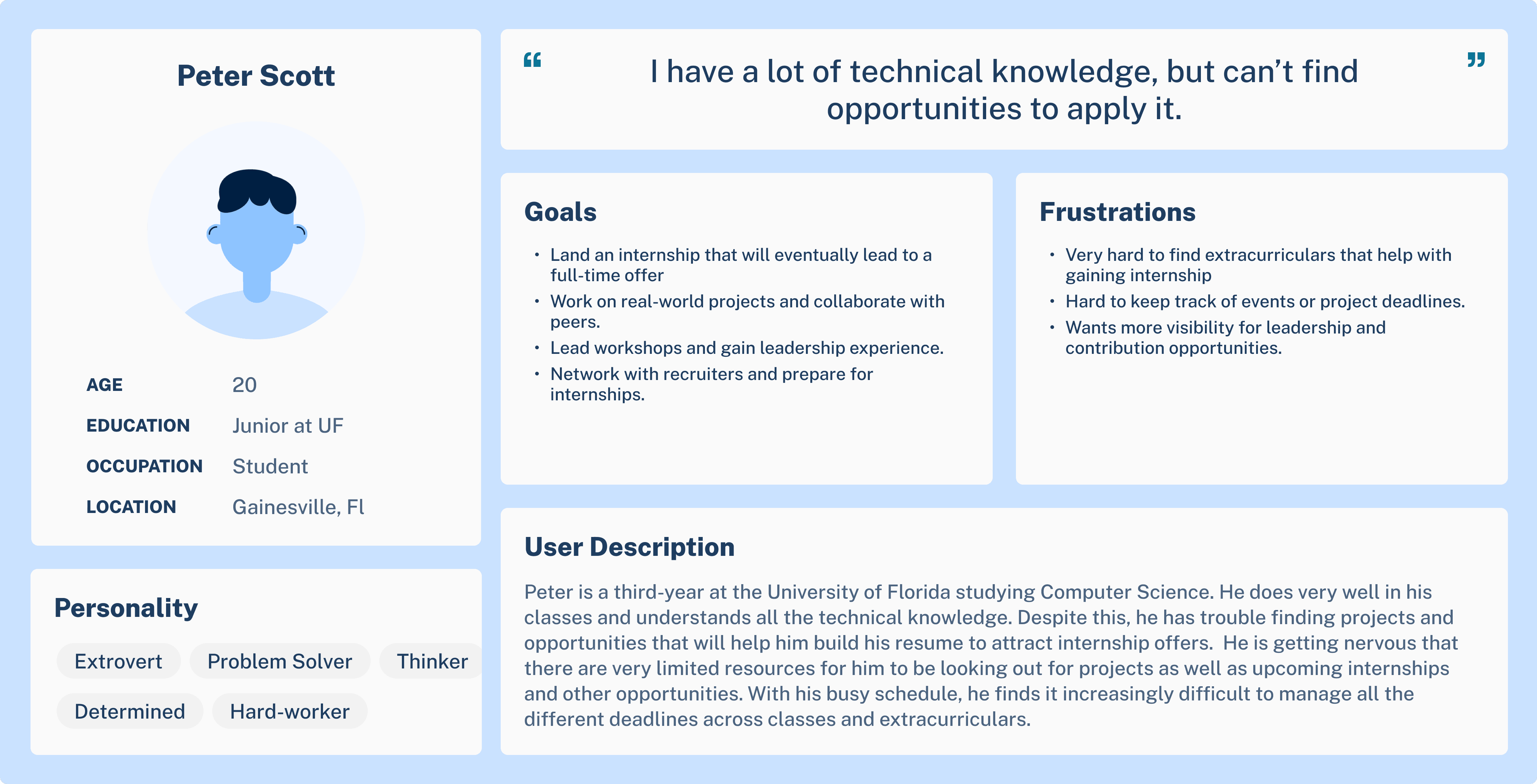
We looked at around twenty sites: UF clubs, software engineering groups at other schools, and a few design orgs. For each, we compared how they handled identity, the homepage pitch, events, resources, and how easy the site looked to keep updated. We then analyzed the unique value proposition each club and their website had to better understand the users we were designing for.

The good sites treated the club like a product
The strongest sites pitched value immediately and had a point of view. CPPSEA led with a "learning by doing" statement, SWE aimed clear join CTAs at new members, and SPCB sold its community rather than just its events. The pattern was a distinct identity and a homepage that tells a student why to care.
The weak sites shared one failure: they were unattended
The most common problem was old content. Abandoned event pages, a calendar sitting empty next to an active Instagram, a project list frozen since 2023. Stale content makes an active club look dead, and that first impression is what a prospective member judges the club on.


Turning findings into a structure
Based on the user research and competitive analyses, we used the MoSCoW framework to prioritize five pages (home, workshops, calendar and events, about and team, and resources), and set a light, minimal, technological direction. Then we moved into lo-fis, hi-fis, and a prototype.


02
Key decisions
What changed
Combining four versions into one
Each of us began by proposing and designing a complete version of the site, giving us several different approaches to consider. We then reviewed each concept together, discussing the strengths and weaknesses of each design and identifying the elements that worked best. From there, we combined the strongest aspects of each proposal into one cohesive direction, which became the foundation for the rest of the project.

Some of our lo-fi iterations that inspired our later designs.
Design choices
An identity that stands apart
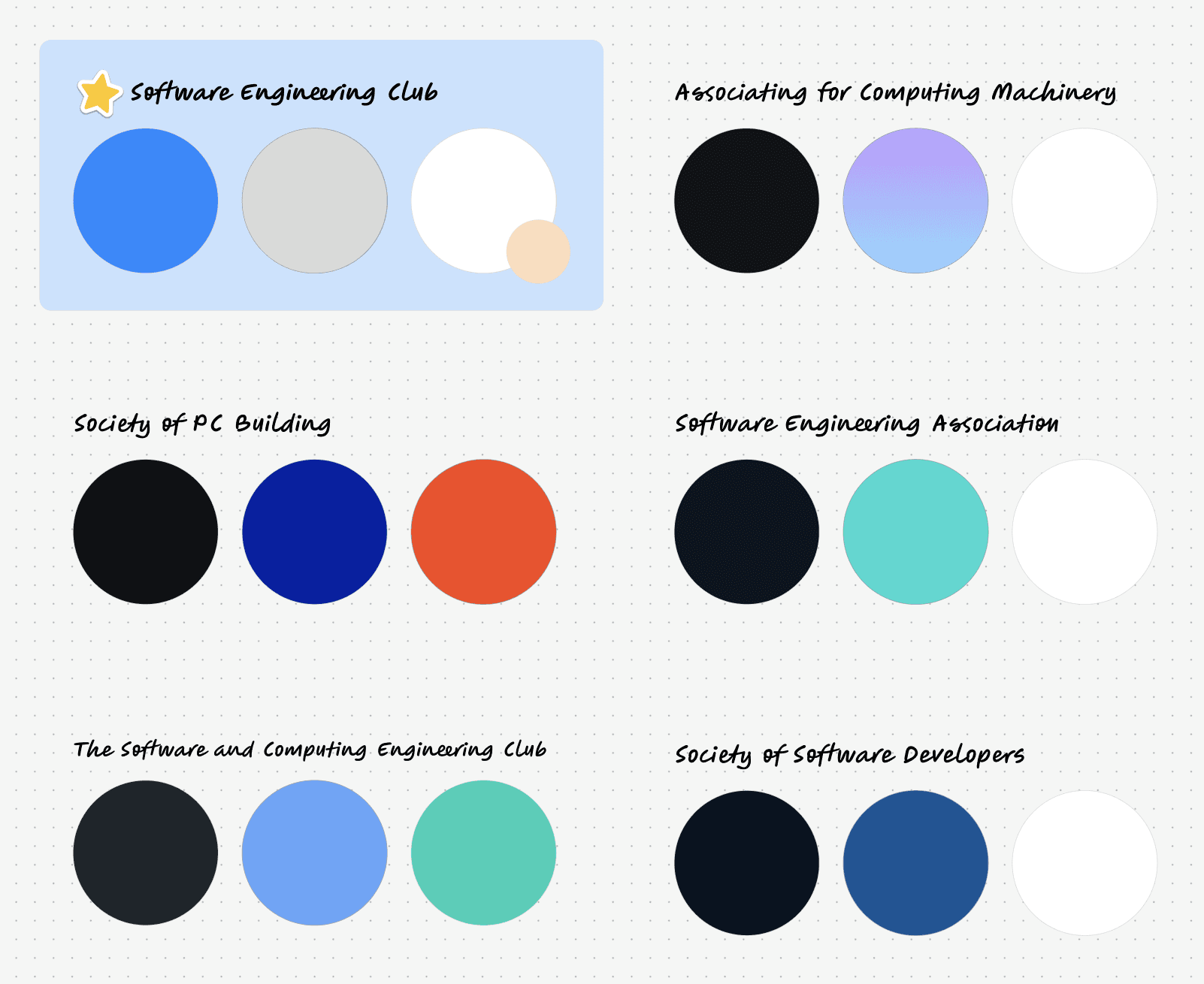
Every UF club we looked at leaned on dark themes with orange and blue, and the software clubs at other schools defaulted to black, teals, blues, and gradients. We kept SEC's light blue and white branding and used orange as an accent color to signify SEC as a UF club. it as the difference. Therefore, it still identifies with UF and software engineering without looking like everyone else. When a club is competing for attention, distinct visuals help set it apart from the rest.

A homepage that pitches the club
Prospective members were a target user group, so the homepage leads with what SEC offers instead of making a student dig for it. This came straight from the research, where the sites that drew people in led with a clear statement of value. We researched SEC's main offerings as well as what drew in the most attention across their social media to narrow down the information.
A banner that keeps the site looking alive
The clearest failure in our research was unattended event pages, so we used the calendar to solve that problem. We added a banner at the top that surfaces the upcoming event, inspired by SEC's original Notion calendar. We also included a card towards the bottom to highlight large events SEC offers as a way to show long-term, active plans for the club, again reinforcing what a prospective member would look out for. what's coming up, the same at-a-glance signal the embedded calendars we liked gave. This would act as a backup for breaks when the club might not have too many events.

Built to stay current
To account for the maintenance of the site, we added a button that acts as an entry point to the admin login. With the little icon button in the corner, admins can easily manage the site while general members can easily ignore. SEC's engineers built the backend and admin side separately, and designing around that handoff was part of keeping the content maintainable, which is what most of the sites we studied got wrong.

04
Results
Prototype
Live website representing the club
By the end, we handed off the hi-fi designs and a prototype, which SEC's engineers built. The site is now live at ufsec.org.
Looking back
Reflections
Minimalism needs substance
The hardest ongoing call was keeping the site clean without letting it feel barren. A growing club's site should not look empty, so I kept looking for the line between minimal and informative.
Turning wants into features
A lot of the work was translating what the client wanted into actual features and flows. When they were unsure of a direction, I learned to ask specific questions to move them toward a decision.

