


Twine
Academic
Mobile App
Team Project
Twine is a mobile marketplace that connects University of Florida student entrepreneurs with the students who want to buy from them. Instead of organizing DMs across various apps, it gives both sides one place to discover services, message with clear intent, and build credibility.
Roles
UI/UX Designer
Team
Ankita Narayan
Mallory Welch
Will Fleckenstein
Skills
UI/UX Design
Interaction Design
Visual Design
Prototyping
Timeline
January 2026 - April 2026
Roles
UI/UX Designer
Skills
UI/UX Design
Interaction Design
Visual Design
Prototyping
Team
Ankita Narayan
Mallory Welch
Will Fleckenstein
Timeline
January 2026 - April 2026
00
Introduction
The Idea
Give UF's student entrepreneurs and the peers who buy from them one place to find each other, instead of being scattered across social media and group chats.
Problem
Two sides that never quite connected
Plenty of UF students run small businesses (like photography, custom products, and food), and plenty of students want to buy from them. But things can get messy when they try to find each other. Entrepreneurs juggle inquiries across Instagram, texts, and group chats, and consumers have no reliable way to discover who offers what. Twine brings both into one platform. The name reflects the idea: two groups intertwined, with discovery and communication in the same place.
Problem
Two sides that never quite connected
Plenty of UF students run small businesses (like photography, custom products, and food), and plenty of students want to buy from them. But things can get messy when they try to find each other. Entrepreneurs juggle inquiries across Instagram, texts, and group chats, and consumers have no reliable way to discover who offers what. Twine brings both into one platform. The name reflects the idea: two groups intertwined, with discovery and communication in the same place.

01
Research
Listening to both sides of the marketplace
We ran semi-structured interviews with seven UF students, four who run small businesses and three who buy from peers, and paired them with a competitive scan of Upwork, Instagram, Etsy, and Pinterest. We chose interviews over observation because we wanted to hear what people actually value in a platform like this, and we organized questions by role so we could compare each group's needs.

Insight 01
Entrepreneurs were drowning in platforms
Sellers juggled up to six tools to run one business while buyers relied on word of mouth.

Insight 02
People wanted to browse, but with limits
Consumers wanted to browse but still have options to narrow down their search based on location, distance, price and more.

Insight 03
Trust comes from proof and honest reviews
Buyers trust portfolios and honest reviews while the sellers want to track growth.


Our early iterations of key features in the app based on our research
01
Research
Listening to both sides of the marketplace
We ran semi-structured interviews with seven UF students, four who run small businesses and three who buy from peers, and paired them with a competitive scan of Upwork, Instagram, Etsy, and Pinterest. We chose interviews over observation because we wanted to hear what people actually value in a platform like this, and we organized questions by role so we could compare each group's needs.
Insight 01
Entrepreneurs were drowning in platforms
Sellers juggled up to six tools to run one business while buyers relied on word of mouth.
Insight 02
People wanted to browse, but with limits
Consumers wanted to browse but still have options to narrow down their search based on location, distance, price and more.
Insight 03
Trust comes from proof and honest reviews
Buyers trust portfolios and honest reviews while the sellers want to track growth.
Our early iterations of key features in the app based on our research
02
Discovery & exploration features
Discovery
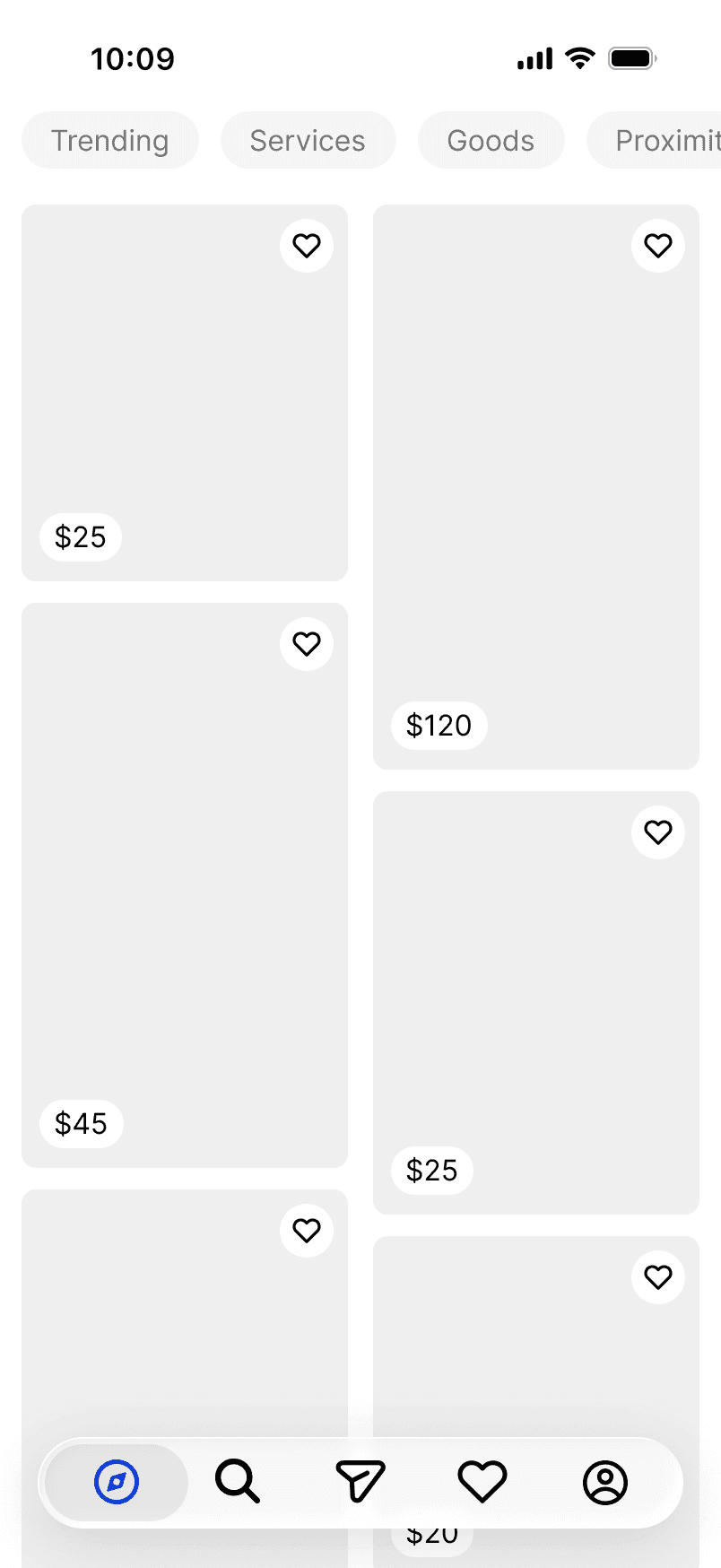
Because people told us they would rather browse than filter, discovery starts in a scrollable feed of listings. Light, optional filters for service type, trending items, and proximity sit on top, but nothing forces a user to narrow before exploring. A dedicated search page lets someone look for a specific service or entrepreneur, and it surfaces suggested and previously viewed profiles so people can pick up where they left off.


Messaging
Conversations that start with intent
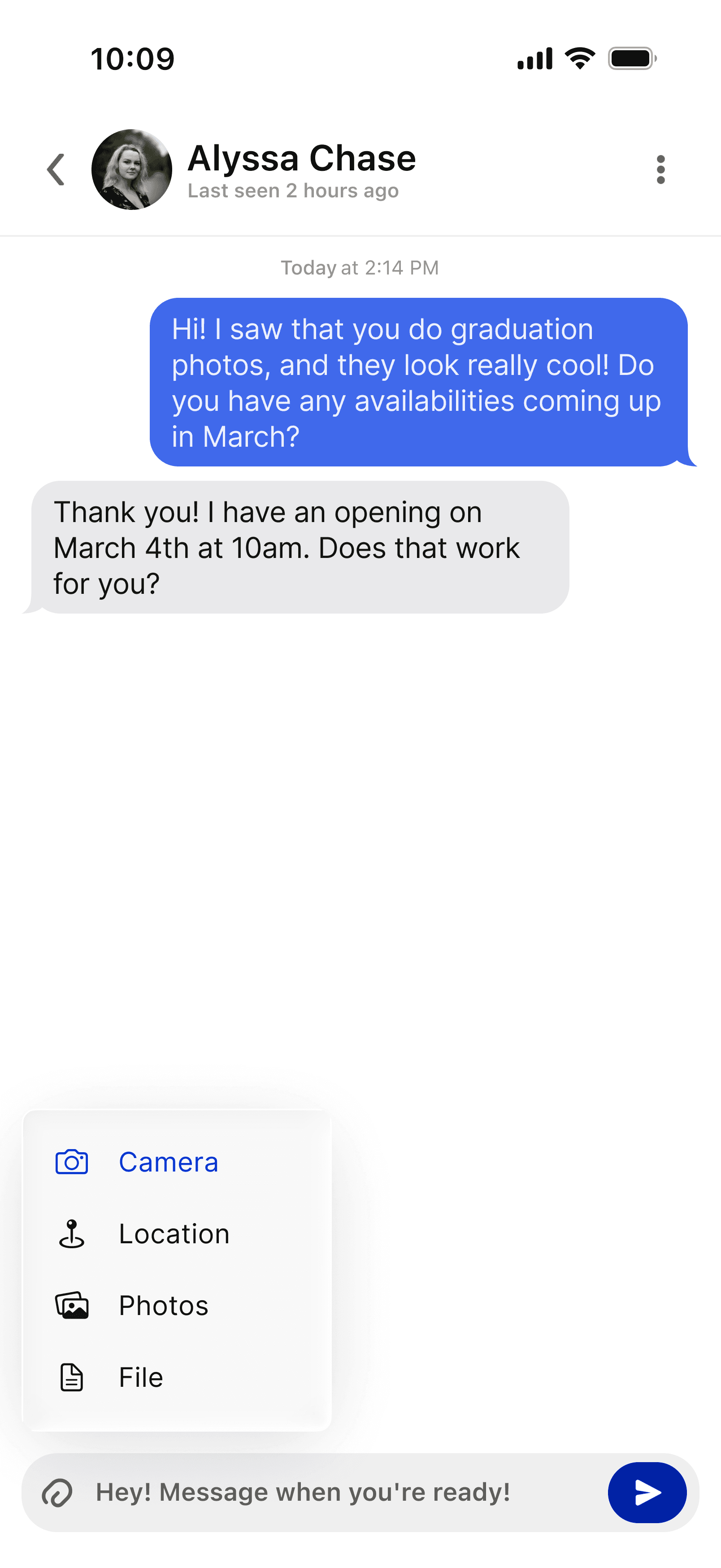
Fragmented communication was the biggest entrepreneur pain point, so all communication lives in one messaging tab. Because a cold hello rarely moves a sale forward, the composer offers guided prompts, like requesting pricing and packages or checking availability, so a consumer can open with clear intent and an entrepreneur knows exactly what is being asked.


Favorites
Save it for later
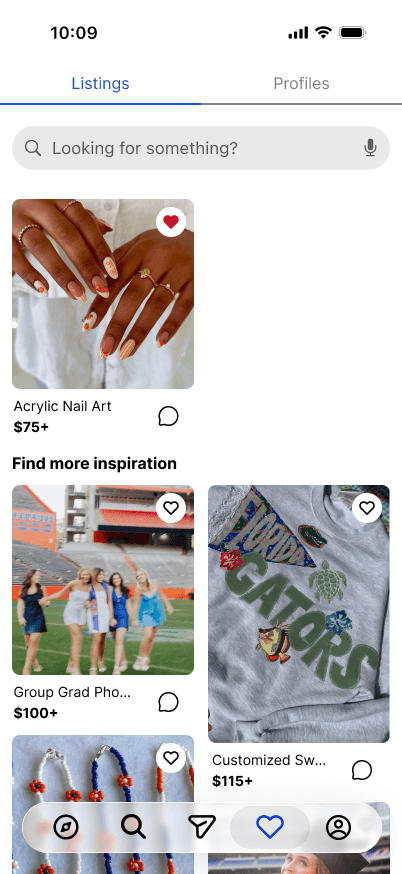
Users can save both listings and profiles to a Favorites space, so someone weighing a few options can keep them in one place instead of scrolling back through the feed to find them again. It is built to support decision-making and to bring people back to the app.

02
Discovery & exploration features
Discovery
Because people told us they would rather browse than filter, discovery starts in a scrollable feed of listings. Light, optional filters for service type, trending items, and proximity sit on top, but nothing forces a user to narrow before exploring. A dedicated search page lets someone look for a specific service or entrepreneur, and it surfaces suggested and previously viewed profiles so people can pick up where they left off.
Messaging
Conversations that start with intent
Fragmented communication was the biggest entrepreneur pain point, so all communication lives in one messaging tab. Because a cold hello rarely moves a sale forward, the composer offers guided prompts, like requesting pricing and packages or checking availability, so a consumer can open with clear intent and an entrepreneur knows exactly what is being asked.
Favorites
Save it for later
Users can save both listings and profiles to a Favorites space, so someone weighing a few options can keep them in one place instead of scrolling back through the feed to find them again. It is built to support decision-making and to bring people back to the app.
03
Profiles
Two views
Consumers told us they judge a student's work by portfolios, past examples, and clear communication, so profiles do different jobs for each side of Twine. An entrepreneur's profile is built to earn trust: it carries a portfolio, posts, ratings and reviews, and an analytics view tracking earnings, profile views, and clients. The consumer-facing version of that same profile is simplified, so a potential customer can evaluate the work and get in touch quickly.
Consumer

Seller


For entrepreneurs, ratings, reviews, and a visible portfolio make credibility easy to read at a glance. For consumers, reviews on a profile can be shown publicly with a username or kept anonymous.
03
Profiles
Two views
Consumers told us they judge a student's work by portfolios, past examples, and clear communication, so profiles do different jobs for each side of Twine. An entrepreneur's profile is built to earn trust: it carries a portfolio, posts, ratings and reviews, and an analytics view tracking earnings, profile views, and clients. The consumer-facing version of that same profile is simplified, so a potential customer can evaluate the work and get in touch quickly.
For entrepreneurs, ratings, reviews, and a visible portfolio make credibility easy to read at a glance. For consumers, reviews on a profile can be shown publicly with a username or kept anonymous.
Consumer
Seller
04
Design principles
The approach
Twine had to feel social and trustworthy, not just functional. We grounded the interface in principles from our coursework including from the CASA paradigm from Apple's Human Interface Guidelines. We researched and applied them across the screens.
Anthropomorphism
A mascot to guide you along the way
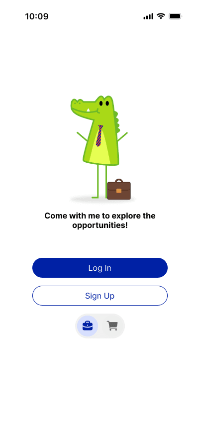
On sign-up, a gator mascot changes with the account toggle. Selecting the business profile gives the gator a briefcase and tie while the consumer profile gives it shopping bags. The gator mascot is carried throughout the app to act as a guide, reinforcing the idea that this app is meant to build connection rather than remain transactional.

Persuading through praise
Praise that is earned, not generic
Drawing on B.J. Fogg's research on praise, the entrepreneur's analytics screen recognizes real progress. When a metric like earnings, profile views, or clients improves, a message tied to the actual number appears, for example, “Your earnings increased by 4% in the last month. Keep it up.” Grounding the praise in real data keeps it authentic and motivates entrepreneurs to stay engaged.
Feedback
Clear, timely status
Consistent and immediate feedback is another area which we focused on. Following Apple's guidance to keep status feedback near the items it describes, the app confirms actions in place. For example, the mascot reacts when you pick a role, unread messages are differentiated, and an eye icon toggles whether a review is public or anonymous. Selected states are a consistent blue, so users always know what they just did and where they are.
04
Design principles
The approach
Twine had to feel social and trustworthy, not just functional. We grounded the interface in principles from our coursework including from the CASA paradigm from Apple's Human Interface Guidelines. We researched and applied them across the screens.
Anthropomorphism
A mascot to guide you along the way
On sign-up, a gator mascot changes with the account toggle. Selecting the business profile gives the gator a briefcase and tie while the consumer profile gives it shopping bags. The gator mascot is carried throughout the app to act as a guide, reinforcing the idea that this app is meant to build connection rather than remain transactional.
Persuading through praise
Praise that is earned, not generic
Drawing on B.J. Fogg's research on praise, the entrepreneur's analytics screen recognizes real progress. When a metric like earnings, profile views, or clients improves, a message tied to the actual number appears, for example, “Your earnings increased by 4% in the last month. Keep it up.” Grounding the praise in real data keeps it authentic and motivates entrepreneurs to stay engaged.
Feedback
Clear, timely status
Consistent and immediate feedback is another area which we focused on. Following Apple's guidance to keep status feedback near the items it describes, the app confirms actions in place. For example, the mascot reacts when you pick a role, unread messages are differentiated, and an eye icon toggles whether a review is public or anonymous. Selected states are a consistent blue, so users always know what they just did and where they are.
05
Prototype
Seller
Consumer
05
Prototype
Seller
Consumer
Looking back
Reflections
Designing for two roles that overlap
A buyer and a seller are often the same student, so the two roles overlapped a lot. I wanted a user's role to stay flexible while keeping it clear what options and features belonged to each side. We deliberately kept much of the functionality consistent across both profiles, because we did not want entrepreneurs to feel like they could not also browse and get services. Balancing that freedom with clarity was the part I kept coming back to.
Managing information without overwhelming people
Contracting a service between students involves a lot of information exchange, and it was easy for screens to get cluttered. I had to learn to manage that information so the app stayed easy to use instead of adding to the decision. There is already some uncertainty when students hire each other, so we did not want the product itself to add stress. Keeping a genuinely complex exchange feeling simple was one of the harder lessons.

On this page
+