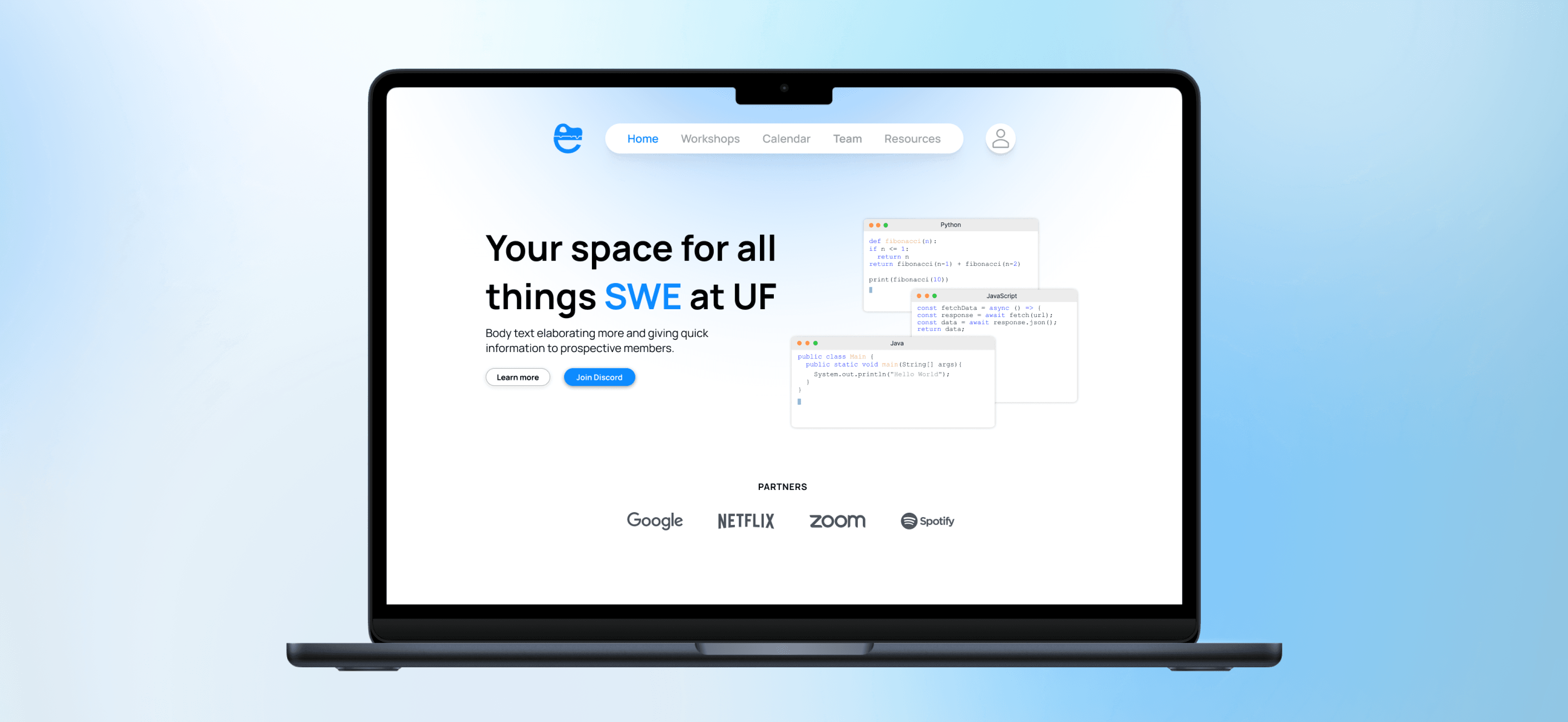
Level5Fleet
Startup Client
Mobile & Web
Solo Work
Truck drivers using Level5Fleet's Admiral Access app kept calling support over faults that were not real problems, like a lock that was simply still connecting. I rebuilt the app's fault and status system so every state answers one question for the driver: wait, act, or call for help.
00
Introduction
Context
Translating engineering codes into plain language
Level5Fleet builds smart locks for trucking fleets. Drivers use the Admiral Access app to lock and unlock trailer equipment over Bluetooth, and dispatchers manage the same fleet from a web dashboard. Auto Fob is the flow where a driver connects to a trailer's cargo door and immobilizer and acts on their status. The hardware reported state accurately. However, the app was confusing in how it communicated that state to the person standing at the trailer.


Screenshots showcasing the original faults flow from the app
Problem
When every state looked like a failure
The visual hierarchy and grouping were the main issues with distinguishing faults. A trailer that was simply searching for a connection used the same orange as a hard fault on the next screen, so drivers assumed something was broken and called support before the app had finished connecting. Faults had the reverse problem: the app showed that something was wrong without saying whether to wait, fix something, or call for help.

The Goal
Turn complicated hardware faults into a clear action a driver can take, and reduce the number of support calls that came from confusion.
01
Making sense of the faults
The Challenge
Translating engineering codes into plain language
The faults came from a dense engineering reference of 40+ codes and technical fields written for developers. I used AI as a thinking partner to translate them into plain language and pressure-test the wording and edge cases. It widened the options quickly, but the final decisions were mine, including overruling it when a suggestion did not fit how a driver would read the screen.


02
Approach
The Idea
Organize faults by what the driver should do
Reading through the translated faults, I realized that every state was really asking the driver to do one of three things. Instead of ranking faults solely on engineering severity, I grouped them by action: wait, do something, call support, or no action. Both the severity and the corresponding action determined what a fault appears to the user.

Examples of how I mapped out the faults to their status
03
Initial designs
First Pass
A first pass built around switching between units
I started by making it easy for drivers to move between the locks on different trailers and containers, assuming quick access to any unit mattered most. I shared these first iterations, built with a design system, with the product and engineering team to test that assumption before building further.


04
Iterations
What Changed
Prioritized status over searching
The product team told me drivers stay with one assigned unit for days at a time, and engineering explained the equipment list is populated by Bluetooth proximity. I had originally focused on optimizing the Equipment Cards on the home page for easy scanning, but I was solving a problem drivers did not have. I dropped that emphasis and prioritized the locking status instead.


Changed wording from device terms to driver terms
The dual-lock system (a cargo door and an immobilizer) made my original labels ambiguous. I replaced the app’s general messages of “Searching” and “Not Found” with more specific, actionable states, and corrected verbs I had carried over from the old app so each control matched its mechanism. I also made sure to expand the ways in which cards would hold faults to account for edge cases.

05
Scope change
Adapting to change
Designing for more than one lock
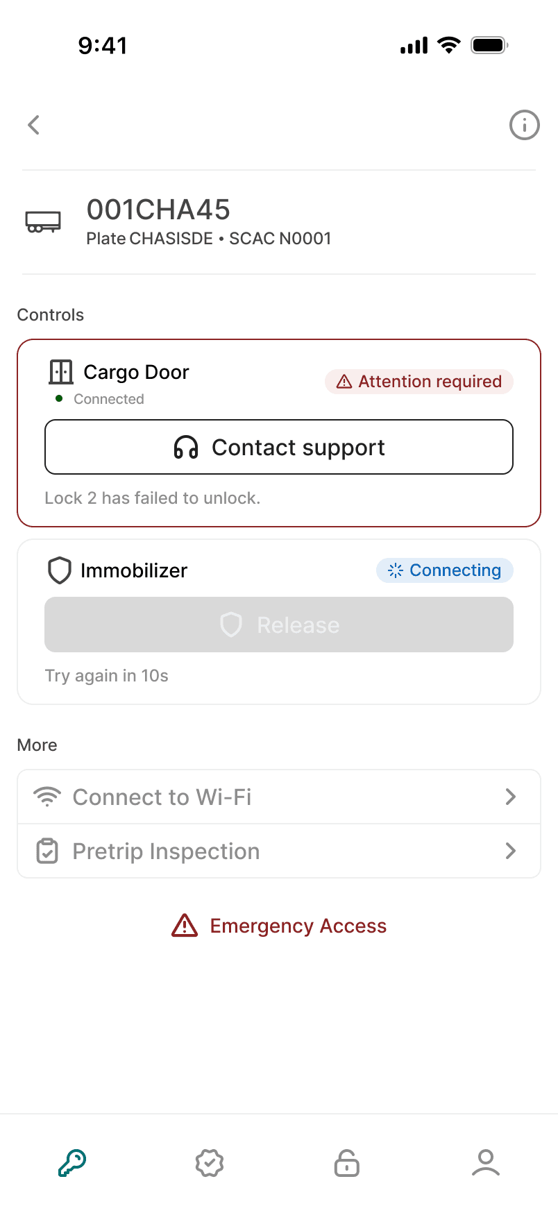
After the mobile redesign was done, engineering extended the system to support up to four locks per trailer. I reworked the mobile screens to show a combined progress state while locking or unlocking, and an attention state that names the specific lock that failed. I then extended the same patterns to the web dashboard, where dispatchers install, replace, and detach individual locks. The web designs were implemented, and the mobile work was handed off to development.


06
Final designs




Impact
Reducing Driver and Support Center stress
Every unnecessary support call is a driver stuck at a gate unable to move freight, and a support team handling a problem that was never real. Turning raw hardware faults into one clear action means a driver can tell at a glance whether to wait, act, or call for help instead of guessing.
Looking Back
Key takeaways
Designing for action, not severity
The biggest shift was to stop describing what the system was doing and start telling the driver what to do about it. Once faults were grouped by action, most of the copy, color, and layout decisions followed from there.
Clarity from complexity
Keeping 40+ technical states legible without overwhelming the driver was the hardest part. One catalog mapping every fault to its action, color, and icon kept the system consistent across design and development, so a complex set of faults still read as a small, predictable set of choices.